App Builder Without Coding: Create Mobile Apps with No-Code App Maker
Over 10,000 amazingly looking mobile apps were designed, built and published on Shoutem’s app-building platform, without a single line of code. Create high-end mobile apps that are compatible with Android and iOS platforms.
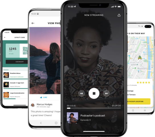

Discover Disclose by Shoutem!
Get an exclusive experience with Disclose mobile app – try, preview and test your app before submitting it to the app stores:
- Play a radio, publish an image on the social wall, listen to your favorite podcast and more
- Create push notifications and see how your push notifications will be displayed to your app users
- Take screenshots for the app store, and much more
Create Your Mobile App in 4 Steps
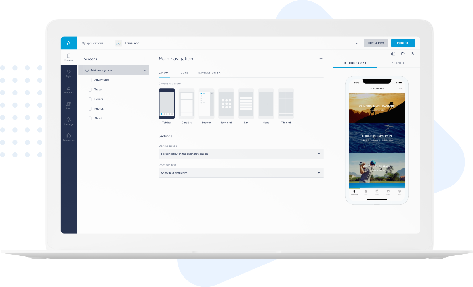
No need to start coding from scratch when using Shoutem. Our immense library has something for everyone. With customizable templates and easy-to-navigate UI, designing your unique app will be a breeze. No prior code knowledge is needed!
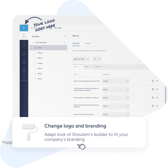
Make your app truly stand out from the crowd. Branding features include everything from icons and images to personalized layouts. Import your logo, design company banners, create custom images, and more to make your app just how you envision it.
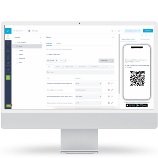
Have outside content you’d like featured in your app? Shoutem makes importing all that data seamless. You can add to your imported content and edit it to your heart’s desire. All of this can be done without the expenses and frustration of coding.
After you finish your app, publishing it is easy with Shoutem. You can add your app to the Google Play Store or Apple Store within just a few clicks. Within moments, your app will be viewable to thousands of potential customers.
What Our Customers Are Saying About Our App Builder Software
Our app building platform helps millions of customers of all sizes across multiple industries
– Ricardo Čerljenko, Zadar Magic Bike

– Geroge Silberberg, MyServices

– Joel Adelsköld, Principal at JENNY Skol


Why Build Mobile Apps for Your Business?
- Monetize your mobile apps, grow your engagement rate, and more!
- Use push notifications to interact with clients
- Monetize your app with ads
- Create deals to engage users
Integrations For Your Mobile Apps


Features of Shoutem’s App Maker
Android and iOS App Builder
These users account for over 95% of the market, and missing out on mobile means being invisible to millions of consumers. Fortunately, Shoutem lets you create an app available for both Android and iOS platforms, ensuring you maximize your leverage.
Drag-and-Drop App Builder
Coding can take hours and requires significant technical knowledge. You can easily customize and integrate content, too. Building an app has never been more accessible than with Shoutem.
App Analytics
Doing so helps you stay ahead of the competition and serve your customers best. Shoutem offers app analytics so you can avoid the lengthy process of analyzing this data yourself. Instead, you get easy to understand reports with key metrics to help you convert visitors into users.
Live Testing and Previewing
Shoutem’s live previews let you view your app as if you were the user. If you spot a bug, fixing it is efficient and hassle-free.
Loyalty Programs
These features often boost customer engagement, increase sales, and give businesses higher reviews. Shoutem offers both single and multi-location loyalty programs, and both are effective at boosting revenues.
Full Branding Availability
This will help customers better connect with and interact with your company. Shoutem offers a plethora of branding options. You can customize anything from imaging to color schemes.
Push Notifications
Push notifications are an excellent way to do that. Shoutem’s notifications can be suited to your specific needs and they can be individualized to each user. Potential uses include promotions, special events, contests, abandoned carts, and more.
Social Media Integrations
Without it, your brand misses out on sales and seems less trustworthy. With Shoutem’s social media integrations, you can easily boost your online presence and influence by posting content directly to Facebook, Twitter, Foursquare, and more.
In-app Payments and Ads
Shoutem lets you scale your app from launch to revenue quickly and easily. You can find many revenue boosting integrations and add-ons that allow you to seamlessly generate extra cash from your app.
Numerous App Integrations
Additional back-end and third-party integrations make the user experience more exciting and engaging. They can also make make your app run smoother and quicker.
Import and Export Your Content
Easily integrate articles, pages, and more from other sources by importing and exporting content.
Benefits of Using Shoutem’s App Maker

Safe and Secure
An unsecure app can quickly lead to loss of revenue, or worse, even legal trouble with your customers. Building your app on a reliable and safe interface allows you to prevent many of these negative outcomes. Shoutem knows the importance of security.
That’s why we add 2-factor authentication, consistent security updates, and more for each of our customers. These safeguards are in place regardless of whether you are building an ecommerce, news, or personal app. You can feel confident knowing Shoutem’s strong security protections are keeping you and your customers safe.

Real-time Updates
Static apps can make users feel trapped, causing disengagement. Real-time updates encourage interactivity and create a more positive user experience. They allow for seamless communication and effortless data sharing.
Shoutem offers a plethora of real-time update options. Just a few of them include push notifications, abandoned cart notifications, live streaming, and feed updates.

Easy To Use
Without any prior coding knowledge or experience, you can create a beautiful and efficient app. Shoutem is a DIY app builder, saving you time and hassle. It’s also easy to use, as it utilizes a drag-and-drop platform and requires zero coding.
As a DIY no-code app development platform, Shoutem can give you the same precision as well as customization that developers use at a fraction of the time and price.

Native App Builder
Another key benefit Shoutem offers is our wide variety of features, making it possible to build virtually any app you imagine. Shoutem is one of the most comprehensive app builders available.
The app’s fifth version, built on React Native, lets you integrate many different platforms and create a truly native app. Native apps that traditionally required coding knowledge can now be built for iOS, Android, and HTML5 without needing any coding experience or knowledge.
Customizations
Your business is unique, and your app should reflect that. Shoutem’s customization features give you access to all the tools you need to create your perfect app.
You can style and design it to your unique desires. Text, backgrounds, links, integrations, colors, and more can all be built to match your goals. Your app will both stand out of the crowd and be easy to navigate as a result.

Templates for Your Mobile App
Save time and money by using sleek, modern templates for your app. Shoutem’s templates are a great place to start if you don’t have a specific look in mind or simply want to save time.
You can still customize these templates and add on to them to make them unique. All of Shoutem’s templates are stylish, great for user interaction, and dynamic. Users will be drawn to your app’s beauty and functionality.
White Label App Builder – Become a top mobile app reseller
 Multiple apps, bigger discounts
Maximize your profits by reducing cost per app and resell apps at the price you want with no restrictions.
 Get Premium support
Get premium email support 24/7 with the option to upgrade further.
 Deliver high-quality apps
Start an app business by improving existing features or developing new ones.
 White label solution
Use your branding and domain to customize your white label CRM the way you want.
App Creator FAQ
-
Can I build an app for free?
Yes! The days of needing to be an engineer or spending thousands of dollars to build an app are over. Now, there are a plethora of app builders available at your fingertips. However, not every app builder is equal. Shoutem offers numerous advantages over the competition. With Shoutem, you can create user-friendly apps for both iOS and Android. To ensure our customers are satisfied, we even offer a 14-day free trial with no credit card registration required. Shoutem also includes customized push notifications, seamless third-party integration, live streaming, and the ability to publish your app on Google Play as well as the Apple App Store.
-
What do app builders do?
App builders are softwares that allow you to build apps without having any prior coding knowledge. One of the great benefits of using app builders is taking advantage of the seamless drag-and-drop design feature. App builders can also save you time, money, and hassle in the process of creating your application.
-
How long does it take to build an app?
Similarly to app pricing, the time it takes to develop an app is variable. If your app is more complex, it takes more time to develop it. Keep in mind that rushing an app’s development, while it does decrease development time, may result in additional charges. To make the most out of Shoutem, try not to rush the development process. Doing so makes your app more precise and potentially saves you money.
-
Can anyone build an app?
Yes, anyone can build an app. You no longer have to hire a developer or learn a programming language to do so. With Shoutem, you get access to a drag-and-drop design platform, making app building accessible to virtually anyone. Even those who previously struggled with app design will find this no-code DIY app development platform a pleasure to use. With highly engaging and easy-to-understand customization tools, you can develop an app in minutes. You could even publish your app to both iOS and Android audiences, create custom loyalty programs, add security features, make your app usable offline, and far more by choosing Shoutem as your app development tool.
-
What is an app builder?
A mobile app builder is an online platform/software/tool that lets users create mobile apps within a short period of time. Mobile app development is done through a drag-and-drop interface, reducing time and expense. We have created a complete building guide If you would like to know how to create an app for Android & iPhone.
-
How much does it cost to make an app?
The cost of building your app depends on numerous factors. For instance, how many users do you want your app to support? Do you want to use intricate designs or simple ones? How many different pages will make up your app? All of these factors determine the ultimate price of creating your app.
In general, the more complex an app is, the greater the cost to develop it. Shoutem charges $59/month for a yearly Android-only plan ($79/month if monthly commitment), both Android and iOS for $99/month for a yearly plan ($129/month for separate monthly billing), and $189/month for a professional yearly plan ($229/month for separate monthly billing).
Find more information HERE.
-
Are there any additional costs?
When developing a mobile app for the App Store, developers should be aware that there is an additional cost for Developer Program: Apple requires developers to enroll in the Apple Developer Program, which involves an annual membership fee that is $99 USD per year for individuals and $299 USD per year for organizations.
When building a mobile app for the Play Store, developers are required to register for a Google Play Developer account. The registration fee is a one-time payment of $25 USD.
